


Website
Design Expert
Your Business, Our Canvas.
Let's paint Success Together.

Website
Design Expert
Empowering Businesses
Your Business, Our Canvas.
Let's paint Success Together.
Check Out Our
Web Design Work
From every niche, we have helped businesses grow online.
Take a look, we would love to add your business to our portfolio!


Check Out Our
Web Design Work
From every niche, we have helped businesses grow online.
Take a look, we would love to add your business to our portfolio!


I’m Corryn, the founder and lead designer here at TWA Studio, where creativity meets clarity. With a blend of professionalism and a zest for life, I lead our projects with enthusiasm and precision. Balancing family joy and a passion for design, I’m dedicated to transforming your visions into impactful, vibrant realities. Let’s make something wonderful together!

Our Services

Brand Design
Craft a unique visual story that defines your brand.

Web Design
Standout online presence.

Social Media
Elevate engagement with expert content curation.

SEO
Get organic traffic to your website with search engine optimization.

I’m Corryn, the founder and lead designer here at TWA Studio, where creativity meets clarity. With a blend of professionalism and a zest for life, I lead our projects with enthusiasm and precision. Balancing family joy and a passion for design, I’m dedicated to transforming your visions into impactful, vibrant realities. Let’s make something wonderful together!
Our Services
Brand Design
Craft a unique visual story that defines your brand.
Web Design
Standout online presence.
Social Media
Elevate engagement with expert content curation.
SEO
Get organic traffic to your website with search engine optimization.
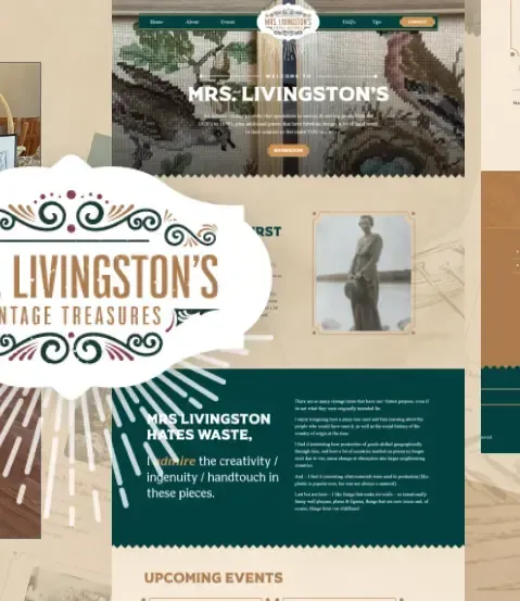
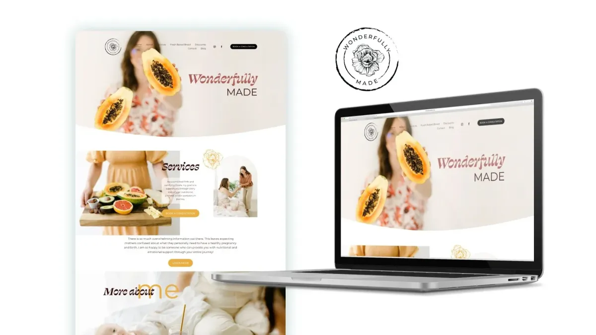
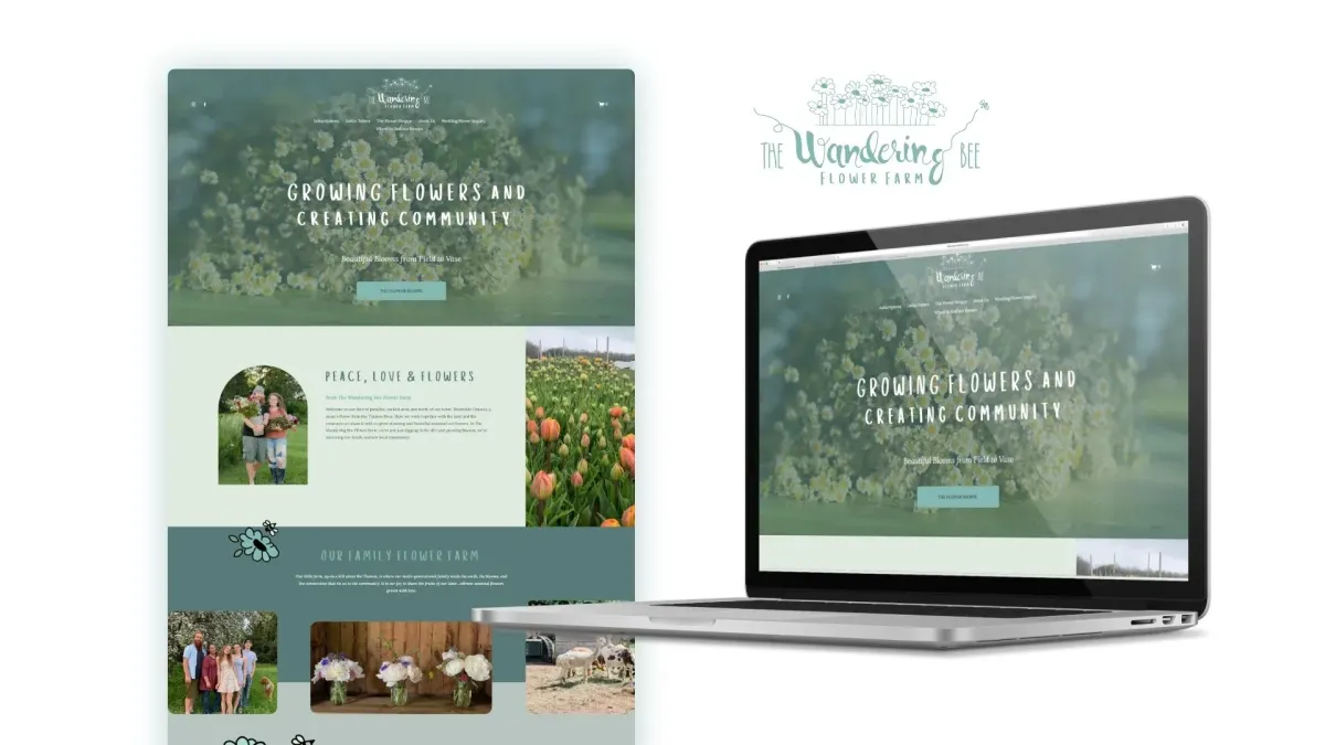
Case Studies
TWA Studio embraces your business and captures exactly what you need to grow!
Case Studies
TWA Studio embraces your business and captures exactly what you need to grow!
Our Locations
New Location!
Meet Corryn in Vernon, British Columbia
TWA Studio is thrilled to announce our relocation to the beautiful province of British Columbia! This move marks an exciting new chapter for us, allowing us to continue delivering exceptional service and innovative solutions from our new home in BC. We look forward to embracing the vibrant community and stunning natural surroundings as we grow and evolve.
Vernon, BC
3202 32 St,
Vernon, BC V1T 5M6
Woodstock, ON
79 Montclair Dr
Woodstock, ON N4V 1C5
Cambridge, ON
Suite 300, 73 Water St N,
Cambridge, ON N1R 7L6
Waterloo, ON
180 Northfield Dr W Unit 4, 1st Floor,
Waterloo, ON N2L 0C7
Bring your
Brand to Life


Bring your
Brand to Life
Customer Testimonials
Let's Chat


Get In Touch
Choose TWA Studio for personalized online marketing services including brand identity, website design, SEO, social media management, and graphic design.


2025 Take Wing Artistry Inc. | All Rights Reserved | Privacy Policy | Terms of Service
Facebook
Instagram
LinkedIn
TikTok
X
Pinterest
Youtube